Monday, September 10, 2012
Similarity Matrix
http://www.google.com/imgres?hl=en&biw=1280&bih=662&tbm=isch&tbnid=0Fw5_jKKdxmtMM:&imgrefurl=http://www.epicentersoftware.com/genetrix/support/WebHelp/Visualization/Similarity_Matrices_and_MDS/Using_Similarity_Matrices.htm&docid=JLJrLV9NwuDTMM&imgurl=http://www.epicentersoftware.com/genetrix/support/WebHelp/SimilarityMatrix-Expressions.gif&w=714&h=507&ei=EnNOUJXpLo_g8ATvjYHYCQ&zoom=1&iact=rc&dur=358&sig=104655054681110617605&page=1&tbnh=123&tbnw=173&start=0&ndsp=18&ved=1t:429,r:9,s:0,i:128&tx=78&ty=80
Similarity Matrix
Similarity Matrix is a two-dimensional graphical display of all pair-wise distances between a set of features or samples. Distances can be calculated in a number of ways, including Euclidean distance, the square of the Euclidean distance, correlation, the absolute value of the correlation, and city block.
Stem and Leaf Plot
http://www.google.com/imgres?hl=en&biw=1280&bih=662&tbm=isch&tbnid=mWLCcttmD7eOwM:&imgrefurl=http://www.nhhealthcost.org/method.aspx&docid=nWiG695vWXWdmM&imgurl=http://www.nhhealthcost.org/i/stemLeafPlot.gif&w=451&h=260&ei=1HFOUJiCC4Ls8wTo84Fw&zoom=1&iact=hc&vpx=334&vpy=342&dur=4953&hovh=170&hovw=296&tx=212&ty=99&sig=104655054681110617605&page=1&tbnh=90&tbnw=156&start=0&ndsp=20&ved=1t:429,r:9,s:0,i:167
Stem and Leaf Plot
Stem and Leaf Plot is a device for presenting quantitative data in a graphical format, similar to a histogram, to assist in visualizing the shape of a distribution.
Box Plot
http://www.google.com/imgres?hl=en&biw=1280&bih=662&tbm=isch&tbnid=KOtFud-PW-PoPM:&imgrefurl=http://www.physics.csbsju.edu/stats/box2.html&docid=h5haAxCZDGfAZM&imgurl=http://www.physics.csbsju.edu/stats/simple.box.defs.gif&w=364&h=370&ei=m3BOUJrrGYr48gS7uoCABg&zoom=1&iact=hc&vpx=721&vpy=167&dur=97&hovh=226&hovw=223&tx=145&ty=138&sig=104655054681110617605&page=1&tbnh=133&tbnw=132&start=0&ndsp=19&ved=1t:429,r:3,s:0,i:148
Box Plot
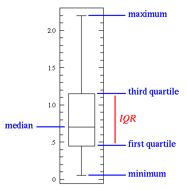
A box plot is a graphic representation of a distribution by a rectangle, the ends of which mark the maximum and minimum values, and in which the median and first and third quartiles are marked by lines parallel to the ends.
Histogram
http://www.google.com/imgres?hl=en&biw=1280&bih=662&tbm=isch&tbnid=9Km_4m_FBosjBM:&imgrefurl=http://www.cyber-wit.com/gallery_histogram.html&docid=FM7a_40G_VG_ZM&imgurl=http://www.cyber-wit.com/images/gallery/histogram1_b.png&w=450&h=320&ei=p29OUIuvIY2y8QTMxoGwDw&zoom=1&iact=hc&vpx=864&vpy=329&dur=1821&hovh=189&hovw=266&tx=133&ty=118&sig=104655054681110617605&page=1&tbnh=127&tbnw=179&start=0&ndsp=18&ved=1t:429,r:10,s:0,i:170
Histogram
Histogram is a bar graph of a frequency distribution in which the widths
of the bars are proportional to the classes into which the variable has been
divided and the heights of the bars are proportional to the class
frequencies. This one shows the final score of all the students.
ParallelCoordinate Graph
http://www.google.com/imgres?num=10&hl=en&biw=1280&bih=662&tbm=isch&tbnid=yOq1sDq9UO4WCM:&imgrefurl=http://andrewgelman.com/2007/10/parallel_coordi/&docid=9eoJ2Z6UZMYHYM&imgurl=http://andrewgelman.com/movabletype/mlm/mdg1.png&w=455&h=339&ei=Pm5OUIayNYWm8ATO6IDICg&zoom=1&iact=hc&vpx=174&vpy=183&dur=7384&hovh=194&hovw=260&tx=111&ty=77&sig=104655054681110617605&page=1&tbnh=127&tbnw=171&start=0&ndsp=18&ved=1t:429,r:0,s:0,i:90
Parallel Coordinate Graph
Parallel coordinates is a common way of visualizing high-dimensional geometry and analyzing multivariate data.
Sunday, September 9, 2012
Triangular Plot
http://www.google.com/imgres?hl=en&biw=1129&bih=604&tbm=isch&tbnid=bxN0NJG8TWHG-M:&imgrefurl=http://www.lboro.ac.uk/research/phys-geog/tri-plot/index.html&docid=Oei52DzkxuJ7NM&imgurl=http://www.lboro.ac.uk/research/phys-geog/tri-plot/fig2.png&w=275&h=248&ei=HsNMUObmNJOe8gSP9YGgCA&zoom=1&iact=rc&dur=1&sig=104655054681110617605&page=1&tbnh=116&tbnw=129&start=0&ndsp=21&ved=1t:429,r:15,s:0,i:134&tx=91&ty=66
Triangular Plot
Triangle plot is a barycentric plot on three variables which sum to a constant. It graphically depicts the ratios of the three variables as positions in an equilateral triangle. This shows information on blocks, slabs, and rods.
Windrose
http://www.google.com/imgres?hl=en&biw=1129&bih=604&tbm=isch&tbnid=QrHMy5WqHjUE5M:&imgrefurl=http://www.rodsbot.com/%3Fc%3D1125&docid=mOu8hSlOnF2QfM&imgurl=http://www.rodsbot.com/images_maps_cache/1125-map-assoc.jpg&w=711&h=720&ei=WcJMUM65LYqo9gTpv4HgDQ&zoom=1&iact=hc&vpx=783&vpy=248&dur=83&hovh=226&hovw=223&tx=126&ty=164&sig=104655054681110617605&page=1&tbnh=117&tbnw=116&start=0&ndsp=21&ved=1t:429,r:12,s:0,i:163
Windrose
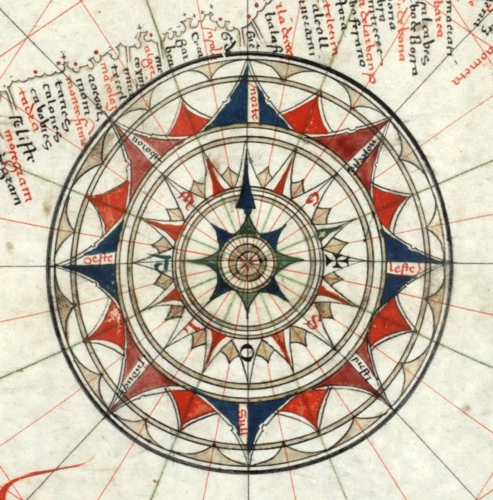
A windrose is a meteorological diagram depicting the distribution of wind direction and speed at a location over a period of time.
Climograph
http://www.google.com/imgres?hl=en&biw=1129&bih=604&tbm=isch&tbnid=dBOl_vkOfxNW8M:&imgrefurl=http://mynasadata.larc.nasa.gov/preview_lesson.php%3F%26passid%3D74&docid=WrDkq9EVbfgD9M&imgurl=https://mynasadata.larc.nasa.gov/images/L74_Climograph.jpg&w=315&h=290&ei=OcFMUJWhG4W89QSor4D4AQ&zoom=1&iact=hc&vpx=98&vpy=163&dur=1473&hovh=215&hovw=234&tx=138&ty=117&sig=104655054681110617605&page=1&tbnh=114&tbnw=114&start=0&ndsp=19&ved=1t:429,r:0,s:0,i:139
Climograph
Climograph is a graph that depicts the annual cycle of temperature and rainfall for a geographical locations. On the graph, one vertical access shows temperature, the second vertical access shows rainfall, and the horizontal access shows time. This one is showing result for Guam.
Population Profile
http://www.google.com/imgres?hl=en&biw=1129&bih=604&tbm=isch&tbnid=gudZGBYh4OgsNM:&imgrefurl=http://www.co.nezperce.id.us/Departments/PlanningandBuilding/ComprehensivePlan/ComprehensivePlanHomePage/Population.aspx&docid=l2vTn-47WdPyHM&imgurl=http://www.co.nezperce.id.us/Portals/0/Planning%252520and%252520Building/ComprehensivePlan/fig_9-3.jpg&w=547&h=427&ei=T8BMUMD6NIKs9ASTwYHQCQ&zoom=1&iact=hc&vpx=262&vpy=290&dur=2413&hovh=198&hovw=254&tx=132&ty=103&sig=104655054681110617605&page=1&tbnh=113&tbnw=150&start=0&ndsp=18&ved=1t:429,r:7,s:0,i:109
Population Profile
Population Profile is a chart showing the number of people as a function of their ages.This one is comparing three decades 1970, 1980, 1990 for the United States.
Scatterplot
http://www.google.com/imgres?num=10&hl=en&biw=1129&bih=604&tbm=isch&tbnid=5tFYJcdPEQdpvM:&imgrefurl=http://www.mathworks.com/help/toolbox/comm/ug/fp6296.html&docid=4yqU9YWzrdVeuM&imgurl=http://www.mathworks.com/help/toolbox/comm/ug/constellqam.gif&w=428&h=468&ei=R79MUO6wH4XM9QSIrIDgAg&zoom=1&iact=hc&vpx=812&vpy=237&dur=2524&hovh=235&hovw=215&tx=120&ty=175&sig=104655054681110617605&page=1&tbnh=117&tbnw=108&start=0&ndsp=21&ved=1t:429,r:19,s:0,i:162
Scatterplot
A scatter plot is a type of mathematical diagram using Cartesian coordinates to display values for two variables for a set of data.
Saturday, September 8, 2012
Accumulative Line Graph or Lorenz Curve
http://www.google.com/imgres?num=10&hl=en&biw=1129&bih=604&tbm=isch&tbnid=vCWK2WnGTBsSIM:&imgrefurl=http://www.mathematics.com.au/watch.html%3Flesson%3Dq9l83dgev47mp&docid=mK95iYd224W81M&imgurl=http://www.mathematics.com.au/images/600x480/5104.gif&w=600&h=480&ei=S9xLUOL2IpGo8QTXloCwDQ&zoom=1&iact=hc&vpx=450&vpy=274&dur=4007&hovh=201&hovw=251&tx=158&ty=170&sig=104655054681110617605&page=1&tbnh=112&tbnw=155&start=0&ndsp=18&ved=1t:429,r:8,s:0,i:104
Accumulative Line Graph
Accumulative Line Graph is a type of chart which displays information as a series of data points connected by straight line. segments. It is a basic type of chart common in many fields.
Bilateral Graph
http://www.google.com/imgres?num=10&hl=en&biw=1129&bih=604&tbm=isch&tbnid=36LAwzrYnFS47M:&imgrefurl=http://www.gallup.com/poll/106858/chinas-leadership-better-regarded-outside-west.aspx&docid=AR0Wf7CGCdavMM&imgurl=http://media.gallup.com/poll/graphs/080429China2Graph2_GASJIDHUQfredo.gif&w=507&h=345&ei=WdpLUMjXDIGu9ASHvIGwBg&zoom=1&iact=hc&vpx=96&vpy=269&dur=2030&hovh=185&hovw=272&tx=165&ty=150&sig=104655054681110617605&page=1&tbnh=101&tbnw=148&start=0&ndsp=18&ved=1t:429,r:6,s:0,i:122
Bilateral Graph
A Bilateral Graph is a graph taht shows two sides or more of something. In this graph is shows the perchantage of approval, disapproval, don't know/refusal of the leaderahip of China.
Nominal Area Choropleth Map
http://www.google.com/imgres?um=1&hl=en&biw=1280&bih=662&tbm=isch&tbnid=sHJ0hWn0pAkICM:&imgrefurl=http://illinoisstate.edu/~jrcarter/Geo204/Choro/Tom/&docid=X9DMI6uPqZuQ5M&imgurl=http://my.ilstu.edu/~jrcarter/Geo204/Choro/Tom/calif-correct-4-quartiles%25257B2%25257D.gif&w=469&h=508&ei=hKBLUO6TG4K89gS2gIHwDQ&zoom=1&iact=hc&vpx=383&vpy=132&dur=3866&hovh=234&hovw=216&tx=113&ty=89&sig=104655054681110617605&page=1&tbnh=143&tbnw=132&start=0&ndsp=15&ved=1t:429,r:1,s:0,i:76
Nominal Area Choropleth Map
Nominal Area Choropleth Maps are a type of thematic maps. It shows information by different shading. This one shows percentage of black condo owners in California.
Unstandardized Choropleth Map
http://www.google.com/imgres?um=1&hl=en&sa=N&biw=1280&bih=662&tbm=isch&tbnid=e0S--DJVgxB1-M:&imgrefurl=http://eps.mq.edu.au/courses/GEOS219/choropleth.htm&docid=QUo9peRh-SlgpM&imgurl=http://eps.mq.edu.au/courses/GEOS219/images/worldtfr.jpg&w=474&h=275&ei=w5pLUJC6B5KM9ASnyYCAAw&zoom=1&iact=hc&vpx=171&vpy=323&dur=2965&hovh=171&hovw=295&tx=189&ty=108&sig=104655054681110617605&page=1&tbnh=116&tbnw=200&start=0&ndsp=15&ved=1t:429,r:5,s:0,i:92
Unstandardized Choropleth Map
Unstandardized choropleth maps utilize raw numbers when displayed. In the map displayed the data displayed is not averaged.
Friday, September 7, 2012
Univariate Choropleth Map
http://www.google.com/imgres?hl=en&biw=1280&bih=662&tbm=isch&tbnid=unjP7N5Hh7ktaM:&imgrefurl=http://www.gisdevelopment.net/application/urban/overview/urbano0032.htm&docid=27r7W0Pn57eFsM&imgurl=http://www.gisdevelopment.net/application/urban/overview/images/urbano032.gif&w=378&h=406&ei=F41KUK7wGJKY9QTB3oG4DA&zoom=1&iact=hc&vpx=405&vpy=291&dur=3937&hovh=233&hovw=217&tx=141&ty=180&sig=104655054681110617605&page=1&tbnh=150&tbnw=140&start=0&ndsp=15&ved=1t:429,r:6,s:0,i:92
Univariate Choropleth Map is a type of tematic map. A map that displays the spatial distribution of an attribute that relates to a single topic, theme, or subject of discourse.
Standardized Choropleth Map
http://www.google.com/imgres?hl=en&biw=1280&bih=662&tbm=isch&tbnid=qqoAubKzTuNXQM:&imgrefurl=http://lotsofmaps.blogspot.com/2010/12/un-standardized-choropleth-map.html&docid=lwmSAUvTRtoJAM&imgurl=https://blogger.googleusercontent.com/img/b/R29vZ2xl/AVvXsEj1rEYws9I23JcrOxIuMAFi42gOTT3dIKJYP1woCILU0fjJ2WEThSCIaAcccFSSr2PUn9rX766eDGM-JOD_ZsYt970U26mJQJuYQIn6RzKHqV5flBX5G7gcXNsAuk2EWKgk2u6Jcz97S0U/s1600/C1MapsVectorAsChart.png&w=490&h=291&ei=m45KUKKuE4bU9QS5i4HABQ&zoom=1&iact=hc&vpx=609&vpy=375&dur=3828&hovh=173&hovw=291&tx=164&ty=106&sig=104655054681110617605&page=1&tbnh=122&tbnw=205&start=0&ndsp=15&ved=1t:429,r:12,s:0,i:111
Standardized Choropleth Map
Data in choropleth maps are standardized to allow comparison of distribution among different areas. Here you can see the Gross Deman Product of the World.
Bivariate Choropleth Maps
http://www.google.com/imgres?hl=en&biw=1280&bih=662&tbm=isch&tbnid=pNKT4IyFOjeAgM:&imgrefurl=http://www.ohistorii.com/choropleth-map-online%26page%3D7&docid=qFfF02fHr8KkgM&imgurl=https://blogger.googleusercontent.com/img/b/R29vZ2xl/AVvXsEgwa_Z91mkIWI34H-P5FZoZWyS8SYpWvc5JY3RfBujb_K6WFqk_CbiMyWZHfrTkNzoEd_0WVgp9qK2V655C2jdDjBILJllYBWpK8KAfDW6G5prtqoFhchojSumIKReUUda1VrTVRuV1Zzw/s320/BivariateChoropleth.gif&w=320&h=222&ei=kItKUNX5O4Ta8wTYwYCoBw&zoom=1&iact=hc&vpx=356&vpy=177&dur=1204&hovh=177&hovw=256&tx=195&ty=119&sig=104655054681110617605&page=2&tbnh=136&tbnw=196&start=16&ndsp=20&ved=1t:429,r:1,s:16,i:129
Bivariate Choropleth Map
A bivariate map displays two variables on a single map by combining two different sets of graphic symbols or colors.
Classed Choropleth Map
http://www.google.com/imgres?hl=en&biw=1280&bih=662&tbm=isch&tbnid=YYuFhwsWlnp4YM:&imgrefurl=http://indiemaps.com/blog/2009/11/the-first-thematic-maps/&docid=lSHrpCgS1yKAtM&imgurl=http://indiemaps.com/images/firsts/prussianChoropleth_classed_1828.png&w=639&h=516&ei=_4lKUOvMJYbm9ATKhoDADA&zoom=1&iact=hc&vpx=821&vpy=308&dur=3343&hovh=202&hovw=250&tx=136&ty=83&sig=104655054681110617605&page=1&tbnh=149&tbnw=185&start=0&ndsp=15&ved=1t:429,r:8,s:0,i:98
Classed Choropleth Map
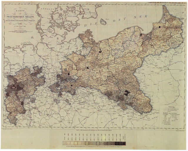
Class Choropleth Maps are based on statistical data aggregated over previously defined regions; for example:counties.
Unclassed Choropleth Map
http://www.google.com/imgres?num=10&hl=en&biw=1280&bih=662&tbm=isch&tbnid=B8cRn3yhSukhEM:&imgrefurl=http://support2.dundas.com/OnlineDocumentation/RSMap/DesigningMaps.html&docid=txSUo87H-K0U3M&imgurl=http://support2.dundas.com/OnlineDocumentation/RSMap/Images/DesigningMaps4.bmp&w=420&h=300&ei=IIVKUImfMoKc8QT6oYCIAw&zoom=1&iact=hc&vpx=186&vpy=358&dur=5314&hovh=190&hovw=266&tx=163&ty=132&sig=104655054681110617605&page=4&tbnh=140&tbnw=202&start=58&ndsp=20&ved=1t:429,r:10,s:58,i:297
Unclassed Choropleth Map
Unclassed Choropleth Maps are those that have equal amounts of categories data variables. Values are shown on a color scale based on the percentage of the measured variable.The darker the color the higher percentage; the lighter the color the lower percentage.
Thursday, September 6, 2012
Range Graded Proportional Circle Map
http://www.google.com/imgres?hl=en&biw=1280&bih=662&tbm=isch&tbnid=11XXHLbl3Xlq1M:&imgrefurl=http://gis.depaul.edu/shwang/teaching/geo381/LN10.htm&docid=hVYYRDllsl4XKM&imgurl=http://gis.depaul.edu/shwang/teaching/geo381/LN10_files/image014.jpg&w=216&h=278&ei=IitJULKbK4H28wS8joHgBw&zoom=1&iact=hc&vpx=188&vpy=312&dur=2541&hovh=222&hovw=172&tx=111&ty=155&sig=104655054681110617605&page=3&tbnh=150&tbnw=112&start=40&ndsp=24&ved=1t:429,r:12,s:40,i:241
Range Graded Proportional Circle Map
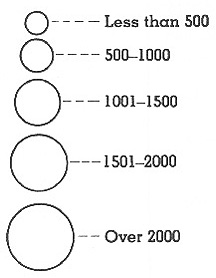
A range graded proportional circle map is a proportional circle map that depicts the circles in relation to ranges of data.
Continuously Variable Proportional Circle Map
e-education.psu.edu
Continuously Variable Proportional Circle Map
A continuously variable proportional circle map is a proportional circle map which utilizes circles to create point data.
DOQQ
http://www.dnr.sc.gov/GIS/descdoqq.html
DOQQ
It combines the the images of a photograph with the geomertic qualities of a map.
-
-
DEM
http://www.google.com/imgres?hl=en&biw=1280&bih=662&tbm=isch&tbnid=6VulzfYc7tVVXM:&imgrefurl=http://www.alpix.com/3d/TerrainViewer/index.html&docid=qROOGXx2XNMGrM&imgurl=http://www.alpix.com/3d/TerrainViewer/TerrainViewer_DEM_and_Texture_1_s.jpg&w=529&h=267&ei=PSdJUNvLGYaY9QSpioGQBw&zoom=1&iact=hc&vpx=627&vpy=334&dur=3221&hovh=159&hovw=316&tx=233&ty=119&sig=104655054681110617605&page=1&tbnh=86&tbnw=170&start=0&ndsp=18&ved=1t:429,r:9,s:0,i:101
DEM
A digital elevation model is a digital model or 3D representation of a terrain's surface it is commonly used for a planet like Earth or the moon, or asteroid.
DLG
http://www.dnr.sc.gov/GIS/img/beaufdlg.gif
DLG
Adigital vector file that contains features such as roads, streams, and elevation contour lines as points, lines or polygons. DLG is also known as TopologicalVector Profile (TVP).
DRG
https://www.google.com/search?num=10&hl=en&site=imghp&tbm=isch&source=hp&biw=1280&bih=662&q=Infrared+aerial+photo&oq=Infrared+aerial+photo&gs_l=img.3..0i24j0i5i24l2.13347.28567.0.29594.21.19.0.2.2.0.377.3148.5j9j1j4.19.0...0.0...1ac.1.f0ijkkuQp9s#hl=en&site=imghp&tbm=isch&sa=1&q=drg+map&oq=DRG+map&gs_l=img.1.1.0i24l3j0i5i24.11195.12057.0.15288.3.3.0.0.0.0.131.362.0j3.3.0...0.0...1c.1.14LTklIOFqU&bav=on.2,or.r_gc.r_pw.r_cp.r_qf.&fp=1577767060329d02&biw=1280&bih=662
DRG
Division of Research Grants;NIH. The NIH component responsible for the receipt and referral of applications to the PHS.
Isopleths
http://www.google.com/imgres?hl=en&biw=1280&bih=662&tbm=isch&tbnid=XU2HkntaV1P31M:&imgrefurl=http://www.esf.edu/es/felleman/440SylF06.html&docid=PPvpS81GFD0NyM&imgurl=http://www.esf.edu/es/felleman/USGeolMap.gif&w=519&h=396&ei=iiRJUKf0KIyk8gSe6oCwCg&zoom=1&iact=hc&vpx=411&vpy=248&dur=2768&hovh=196&hovw=257&tx=152&ty=126&sig=104655054681110617605&page=2&tbnh=139&tbnw=182&start=18&ndsp=22&ved=1t:429,r:1,s:18,i:135
Isopleths
Isopleths are a line on a map or diagram connecting points for which a chosen quantity has the same value.
Isopach
http://www.google.com/imgres?hl=en&biw=1280&bih=662&tbm=isch&tbnid=JIFIE1Pi7CbSVM:&imgrefurl=http://www.glossary.oilfield.slb.com/DisplayImage.cfm%3FID%3D114&docid=XiNlNig2zerfyM&imgurl=http://www.glossary.oilfield.slb.com/files/OGL98135.gif&w=600&h=387&ei=jiFJUIPCFZKK9gTUsYDwBQ&zoom=1&iact=hc&vpx=174&vpy=161&dur=39&hovh=180&hovw=280&tx=124&ty=83&sig=104655054681110617605&page=1&tbnh=123&tbnw=191&start=0&ndsp=17&ved=1t:429,r:0,s:0,i:73
Isopach
Isopach is a line on a map or diagram connecting points beneath which a particular stratum or group of strata has the same thicknes.
Isohyets
https://www.google.com/search?num=10&hl=en&site=imghp&tbm=isch&source=hp&biw=1280&bih=662&q=Infrared+aerial+photo&oq=Infrared+aerial+photo&gs_l=img.3..0i24j0i5i24l2.13347.28567.0.29594.21.19.0.2.2.0.377.3148.5j9j1j4.19.0...0.0...1ac.1.f0ijkkuQp9s#hl=en&site=imghp&tbm=isch&sa=1&q=isohyets&oq=isohyets&gs_l=img.1.0.0j0i24l4j0i5i24l2.3775.15706.0.18555.12.12.0.0.0.0.401.1545.5j5j4-1.11.0...0.0...1c.1.mWnYPM7BYoc&bav=on.2,or.r_gc.r_pw.r_cp.r_qf.&fp=1577767060329d02&biw=1280&bih=662
Isohyets
This type of map has lines on it to determine how much rain fall.
Isotaches
http://www.google.com/imgres?hl=en&biw=1280&bih=662&tbm=isch&tbnid=elppml-O97q69M:&imgrefurl=http://www.underthemeso.com/blog/%3Fm%3D200702&docid=YGRJKwDR8n3a4M&imgurl=http://www.underthemeso.com/blog/wp-content/uploads/entry_20070223_1.gif&w=538&h=532&ei=WR9JUK7CKpOi8ASh_IGYDw&zoom=1&iact=hc&vpx=902&vpy=185&dur=674&hovh=223&hovw=226&tx=93&ty=85&sig=104655054681110617605&page=1&tbnh=136&tbnw=138&start=0&ndsp=18&ved=1t:429,r:4,s:0,i:88
Isotaches
Are lines in a given surface connecting points with equal wind speed.
Isobars
http://www.google.com/imgres?hl=en&biw=1280&bih=662&tbm=isch&tbnid=u4LxGH0SwFD22M:&imgrefurl=http://www.daviddarling.info/encyclopedia/I/isobar.html&docid=pv-ndVDUbGE8PM&imgurl=http://www.daviddarling.info/images2/isobars.gif&w=552&h=351&ei=Qx5JUP_pCYeu9ASl3YHQBQ&zoom=1&iact=hc&vpx=955&vpy=190&dur=632&hovh=179&hovw=282&tx=189&ty=106&sig=104655054681110617605&page=1&tbnh=113&tbnw=178&start=0&ndsp=18&ved=1t:429,r:5,s:0,i:128
Isobars
This map has a line or lines connecting 2 points that have the same atmospheric pressure at a given time or on average over a given period.
LIDAR
https://www.google.com/search?num=10&hl=en&site=imghp&tbm=isch&source=hp&biw=1280&bih=662&q=Infrared+aerial+photo&oq=Infrared+aerial+photo&gs_l=img.3..0i24j0i5i24l2.13347.28567.0.29594.21.19.0.2.2.0.377.3148.5j9j1j4.19.0...0.0...1ac.1.f0ijkkuQp9s#hl=en&site=imghp&tbm=isch&sa=1&q=LIDAR&oq=LIDAR&gs_l=img.3..0l10.232291.240249.2.244836.13.13.0.0.0.0.442.1740.5j6j1j0j1.13.0...0.0...1c.1.orymmNyQkR4&bav=on.2,or.r_gc.r_pw.r_cp.r_qf.&fp=1577767060329d02&biw=1280&bih=662
LIDAR
This type uses a detection system that works on the principle of radar, but uses light from a laser.
Black and White Aerial Photo
http://www.google.com/imgres?num=10&hl=en&sa=X&biw=1280&bih=662&tbm=isch&tbnid=xb1M-jalEzWt1M:&imgrefurl=http://www.jaha.org/edu/flood/rebuild/img/panoramas/index.html&docid=WellLWqmgjzVXM&imgurl=http://www.jaha.org/edu/flood/rebuild/img/panoramas/550w/JT_aerial-1920s-550.jpg&w=550&h=430&ei=KxtJUPK6I4Pk9ATG64HgCg&zoom=1&iact=hc&vpx=180&vpy=350&dur=392&hovh=198&hovw=254&tx=185&ty=110&sig=104655054681110617605&page=1&tbnh=136&tbnw=178&start=0&ndsp=18&ved=1t:429,r:12,s:0,i:125
Black and White Aerial Photo
A black and white aerial photo, is a form of remote sensing that uses black and white film to capture images of certain areas from the air or space. These images are useful for mapping land cover and surface features.
Infrared aerial photo
https://www.google.com/search?num=10&hl=en&site=imghp&tbm=isch&source=hp&biw=1280&bih=662&q=Infrared+aerial+photo&oq=Infrared+aerial+photo&gs_l=img.3..0i24j0i5i24l2.13347.28567.0.29594.21.19.0.2.2.0.377.3148.5j9j1j4.19.0...0.0...1ac.1.f0ijkkuQp9s
Infrared aerial photo
These are photos taken from aircrafet or spacecrafet of the ground surface.
Monday, September 3, 2012
Cartographic Animations
http://www.google.com/imgres?num=10&hl=en&biw=1280&bih=662&tbm=isch&tbnid=K7h0ptkwNkexaM:&imgrefurl=http://jessicasmaps.blogspot.com/2010/04/cartographic-animation.html&imgurl=https://blogger.googleusercontent.com/img/b/R29vZ2xl/AVvXsEhs3j4LUjpTrfnXmtKA5ge4FPncaTr5TlDnLTopsvztexlaZzxbJRWJFe8SJ7pEDrxhXlml-pAghNzC22CnCd9JorYaxE8JHXhz0iPpLEJqI0POP0FDC5pdWv7FbKwopnY6phqRMK6g0rs/s1600/cartographic%252Banimation.gif&w=468&h=500&ei=SkJFUImnKYGk8QTRnoGoBQ&zoom=1&iact=hc&vpx=739&vpy=292&dur=1289&hovh=232&hovw=217&tx=136&ty=103&sig=104655054681110617605&page=1&tbnh=143&tbnw=134&start=0&ndsp=16&ved=1t:429,r:8,s:0,i:101
Cartographic Animations
This type of map uses real time animation. Weather men use this type of map and it comes in handy here in the panhandle - Tropical Storm/Hurrican Isaac that just effected us recently. They (the weather people) used this type of map to track the storm.
Statistical Map
http://www.google.com/imgres?num=10&hl=en&biw=1280&bih=662&tbm=isch&tbnid=xMXIg1KkfdciNM:&imgrefurl=http://kimberlysmappingproject.blogspot.com/2009/04/statistical-maps.html&imgurl=https://blogger.googleusercontent.com/img/b/R29vZ2xl/AVvXsEj8sLLboCdFzH7_iWHxQzMHiX8DeOojcRMm1sS5FN8UDnFmJ94s8wbIzDSB4lD_i8jReEJPNneL5IgjUXX4l1hW51ZaSKp_YkYzzcBL3ANldny5Srnqlp7thFaDdOGIGjGUrdXoOzYeuBqk/s400/statistical%252Bmap.jpg&w=400&h=295&ei=vEBFUNLhEZDA9gSK4IHQBw&zoom=1&iact=hc&vpx=177&vpy=333&dur=269&hovh=193&hovw=262&tx=120&ty=132&sig=104655054681110617605&page=1&tbnh=133&tbnw=180&start=0&ndsp=18&ved=1t:429,r:6,s:0,i:135
Statistical Map
This type of map gives information. Rainfall, Population, Crops, Homelesness, Election Race (Presidental) are just a few examples of how you could use this type of map. A Dot Map falls under this type of map catagorey. This map is showing the decrease or increase of break ins.
Statistical Map
This type of map gives information. Rainfall, Population, Crops, Homelesness, Election Race (Presidental) are just a few examples of how you could use this type of map. A Dot Map falls under this type of map catagorey. This map is showing the decrease or increase of break ins.
Cartograms
http://www.google.com/imgres?hl=en&sa=X&biw=1280&bih=662&tbm=isch&prmd=imvns&tbnid=3cHu6L4ArsAi6M:&imgrefurl=http://www-personal.umich.edu/~mejn/cartograms/&imgurl=http://www-personal.umich.edu/~mejn/cartograms/world1024x512.png&w=1024&h=512&ei=WD9FUIm9FpOG9QSJq4GACg&zoom=1&iact=hc&vpx=338&vpy=201&dur=850&hovh=159&hovw=318&tx=188&ty=68&sig=104655054681110617605&page=1&tbnh=89&tbnw=178&start=0&ndsp=17&ved=1t:429,r:1,s:0,i:132
Cartograms
This type of map shows statistical data.
Cartograms
This type of map shows statistical data.
Flow Map
http://www.google.com/imgres?num=10&hl=en&biw=1280&bih=662&tbm=isch&tbnid=SlE37CWJGyVCEM:&imgrefurl=http://zburke1988.blogspot.com/2011/04/flow-map.html&imgurl=https://blogger.googleusercontent.com/img/b/R29vZ2xl/AVvXsEisSHw9Ofc9Yxj7qfbW5MPoLWso1dC7KXhFoHFx2rcHGCx55bKdqBsYjjZRV_gkRog3xf6yKIq4nn1ezf5VO2Cg2wqYhycynJNtOi7yHgL7-WXKz8ip4lmC_Qhtn0oOXwPha6fMPvKf_hN3/s1600/flow.jpg&w=723&h=524&ei=5D1FUMO6C4_89gTJkIGIBw&zoom=1&iact=hc&vpx=973&vpy=330&dur=1918&hovh=191&hovw=264&tx=153&ty=96&sig=104655054681110617605&page=1&tbnh=133&tbnw=184&start=0&ndsp=16&ved=1t:429,r:10,s:0,i:173
Flow Map
A fow map shows the direction of an object(s) movement - where it is going.
Isoline Map
http://www.google.com/imgres?num=10&hl=en&biw=1280&bih=662&tbm=isch&tbnid=wP0Pg3pJD9a74M:&imgrefurl=http://acartographicalworld.blogspot.com/2010/12/isoline-map.html&imgurl=https://blogger.googleusercontent.com/img/b/R29vZ2xl/AVvXsEhyVGnDfqaTkVCo51ln1bk_ZkVni5kD53M6_va06_sWeIc5WQQR9aftNKEUNSI7WEDNfHTljVGWUJCfkk7qth3xx1G-MBi6XvEMgbXzLIo2uEPj6RxkOKXkKp2YLDVC_gpv1gN6yyGYbJAG/s400/isoline%252Bmap.JPG&w=241&h=261&ei=8jxFULzlAoj28wSB_4HACg&zoom=1&iact=hc&vpx=372&vpy=178&dur=4103&hovh=208&hovw=192&tx=122&ty=102&sig=104655054681110617605&page=2&tbnh=140&tbnw=129&start=18&ndsp=24&ved=1t:429,r:13,s:18,i:226
Isoline Map
This type of map connects to points of equal value by a line or graph/chart.
Proportional Circle Map
https://blogger.googleusercontent.com/img/b/R29vZ2xl/AVvXsEj5iWCCmOWNBx0QVdf-2ev5BJFvwgyngJ59j8vMVpnkXd-vdC_b-UGc7dWmGALbJg58Fdx3t-vO8shzHcdzQJ42yYL8WAEUdArTNrFXIjP_mrG9bxXe_37pGgNxVVBrf5KLv_meIOqjvJaz/s1600/dotProporCircle.jpg
Proportional Circle Map
These maps are drawn to scale. They also use geograpic data so most people can understand them.
Choropleth Map
http://www.google.com/imgres?hl=en&biw=1264&bih=654&tbm=isch&tbnid=kJzU0SZY0FyzSM:&imgrefurl=http://jeremytheadventurer.blogspot.com/2011/04/classed-choropleth-map.html&imgurl=https://blogger.googleusercontent.com/img/b/R29vZ2xl/AVvXsEhUh47ixJM3mWWsQuW9C9op3PvaYmNEy5uGIsOi0yle1a5qoLci8cr5F6K4hrrR62sPAUYYh7SeL5M3J4zkuuyr_SLPZFsCzBUEadcyRM5tjCrtwvkZXQVjQu6b3ho9HCk8JFRI9mNdPwFr/s1600/classed%252Bchoropleth%252Bmap.jpeg&w=427&h=403&ei=IexEUIfmFYem8QTckICgAg&zoom=1&iact=hc&vpx=845&vpy=320&dur=1500&hovh=218&hovw=231&tx=102&ty=178&sig=104655054681110617605&page=1&tbnh=132&tbnw=140&start=0&ndsp=18&ved=1t:429,r:16,s:0,i:189
Choropleth Map
This type of map uses different type of coloring, shading or symbols to indacate the different pricing of land in different areas.
Dot Distribution Map
http://www.mobot.org/jwcross/duckweed/Lemna_graphics/Map2.gif
Dot Distribution Map
This type of map is used typically to tell the population of the area or region. The bigger the dot the bigger the population.
Propaganda Map
http://www.google.com/imgres?hl=en&pws=1&biw=1264&bih=654&tbm=isch&tbnid=zYug4qfGeeyyQM:&imgrefurl=http://www.telegraph.co.uk/culture/7706372/At-last-I-can-see-the-point-of-maps.html&imgurl=http://i.telegraph.co.uk/multimedia/archive/01633/maps-image_1633463c.jpg&w=460&h=288&ei=felEUMHkJYrm8gT874HYBw&zoom=1&iact=hc&vpx=168&vpy=317&dur=48&hovh=178&hovw=284&tx=119&ty=104&sig=104655054681110617605&page=1&tbnh=115&tbnw=184&start=0&ndsp=18&ved=1t:429,r:6,s:0,i:92
Propaganda Map
A propaganda Map is a map that is made up - not for real.
Hypsometric Map
http://www.google.com/imgres?hl=en&pws=1&biw=1264&bih=654&tbm=isch&tbnid=6lV6ZP1QsPfclM:&imgrefurl=http://my.ilstu.edu/~jrcarter/LDEO/Geo201maps.htm&imgurl=http://www.ilstu.edu/~jrcarter/LDEO/LDEO-land-ocean.jpg&w=501&h=320&ei=C-hEUKOwF5O29gSrzIH4Cg&zoom=1&iact=hc&vpx=164&vpy=348&dur=194&hovh=179&hovw=281&tx=155&ty=106&sig=104655054681110617605&page=1&tbnh=110&tbnw=173&start=0&ndsp=18&ved=1t:429,r:6,s:0,i:95
Hypsometric Map
This type of map is usually a topograpic map that is given shading to show the contours and elevations of the different regions.
PLSS Map
https://blogger.googleusercontent.com/img/b/R29vZ2xl/AVvXsEiUtLurQnTRybon7DiKLJEAE3ABNstE6oRt4M0FRgCYsBRCeualsQRQTK9O2yL_t4iONomwHI39e3TnTSUfnccuXcX_FomQOOJuYq0DoJy6ZEQtmCsQsWPHCLRe5fC-rgwsV3uXrnFqQjdx/s1600/PLSS+maps.jpg
PLSS Map
PLSS means Public Land Survey System. This is the most historical method used in the United States. It shows the partioal of land before evantual ownership. This is typically in rual and undeveloped land areas. This PLSS is of Franklin County Alabama
PLSS Map
PLSS means Public Land Survey System. This is the most historical method used in the United States. It shows the partioal of land before evantual ownership. This is typically in rual and undeveloped land areas. This PLSS is of Franklin County Alabama
Cadastral Map
http://uts.cc.utexas.edu/~wd/courses/373F/gif/maps05.gif
Cadastral Map
This type of map shows boundries and ownwership. So, youcan see here a community and how the land or lots are mapped out.
Cadastral Map
This type of map shows boundries and ownwership. So, youcan see here a community and how the land or lots are mapped out.
Thematic Map - World
http://www.printablemapstore.com/images/small/world_thematic_maps/general_maps/world_time_zone_map_t.jpg
Thematic Map
A thematic map normally has a theme about it. It can be social, politacal, religious, etc in nature. It can also be of a community, city,state,country, regin, or of the whole world. This thematic map is the time zones of the world.
Sunday, September 2, 2012
Topographic Map - Cheny Map
http://www.geology.ewu.edu/geol100/chenymap.jpg
Topographic Map
Usually with a Topographic Map you can see natural and man made things.On this map you can see natural landmarks like the river but you can also see roads and buildings.
Topographic Map
Usually with a Topographic Map you can see natural and man made things.On this map you can see natural landmarks like the river but you can also see roads and buildings.
Planimetric Map - Arifica
http://web.uflib.ufl.edu/maps/MAPAFRICA054L.JPG
Planimetric Map
A Planimetric Map is also known as a line map. It shows the horizontial postion of whatever is mapped.In this case it is showing where Africa is postioned.
Planimetric Map
A Planimetric Map is also known as a line map. It shows the horizontial postion of whatever is mapped.In this case it is showing where Africa is postioned.
Subscribe to:
Posts (Atom)